Those that are successful at branding their images build an internal narrative and an avid external community. The images not just perfectly represent what the brand stands for and who they are, but also connect to their customers on what they want to be or feel about the product.
Brand imagery can quickly build a brand reputation even as before the customer knows or sees the brand logo itself. As it has been said time and again, “a picture says a thousand words”, and so one should never underestimate the use of brand images.
Our Images
What works (so far)
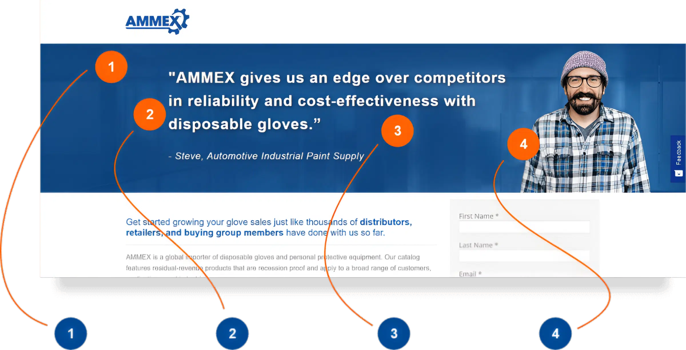
Through the course of the redesign of the website and digital ad campaigns, we’ve gotten to do our fair share of using different images, image styles and themes. So far, below is what we know what’s worked well for us. The image below is currently seen on our contact us form pages. We’ve tried all-image, full banner ones, duo-toned, product images, and through all that, this worked best according to analytics. So let’s breakdown the anatomy of a successful AMMEX image and also the elements around it as everything should work together well.
The AMMEX blue color theme is well implemented on the above the fold area.
Here imagery is complimented by great copy, one that helps assure clients that AMMEX is a great company to deal with. Copy and image also does not compete with each other and so there is a nice balance to the composition.
A subtle yet essential element that is helping the composition work well is the background. It complements to bring the eyes of the user towards the message and the hero image. Simplicity is key here.
Of all the images we’ve used, our friend here is part of why our most successful form page continuously outperforms our previous versions. The genuinely friendly smile and “happy customer” feels this image has, has helped boost the performance of the forms and pages where he has been used. The warm tone of his skin jumps out against the cool and fun but professional blue color theme we have, overall, giving the page visitors a warm welcome and a reassuring undertone of that glove professionals are ready to help them as partners to sell more gloves.