
Typography
Inter is our corporate typeface, along with the other member of the Arial font family, it should be used in all instances where typography is required. This classic font is readily and freely available on all OS and device platforms.
Typography should not be overlooked as a key element whenever there is a need to create designs for brand communication.
It is important to adhere to the leading, tracking and text arrangement specified in this document to help achieve brand consistency all throughout.

Font Family
Inter Regular
Lorem Ipsum
1234567890
Inter Extra Light
Lorem Ipsum
1234567890
Inter Light
Lorem Ipsum
1234567890
Inter Medium
Lorem Ipsum
1234567890
Inter Semi Bold
Lorem Ipsum
1234567890
Inter Bold
Lorem Ipsum
1234567890
Inter Extra Bold
Lorem Ipsum
1234567890
Inter Black
Lorem Ipsum
1234567890
Note: If unable to use the font Inter, Arial is a suitable replacement.
Arial Regular
Lorem Ipsum
1234567890
Arial Bold Italic
Lorem Ipsum
1234567890
Arial Bold
Lorem Ipsum
1234567890
Web Typography Rules
H1
1px


Lorem Ipsum Dolor Sit Amet Adipiscing Elit
Class aptent taciti
Sociosqu ad litora torquent per conubia nostra, per inceptos himenaeos. Integer ligula justo, ornare eu consequat ut, mattis sed nisi. In rutrum ipsum quam. Nunc ut pharetra lorem, sit amet suscipit elit. Suspendisse tempor suscipit eros…
Aptent taciti
Pellentesque habitant morbi tristique senectus et netus et malesuada fames ac turpis egestas. In eget massa lorem. Suspendisse potenti. Cras luctus, nisi id tempus dapibus, metus diam maximus nisl, ac efficitur sapien enim sit amet orci. Fusce tristique tempus magna eu vestibulum…
H2
Header 2 styling will be mostly every time the H1 has subtext or added description right after it.
Lorem Ipsum Dolor Sit Amet Adipiscing Elit


Class aptent taciti
Sociosqu ad litora torquent per conubia nostra, per inceptos himenaeos. Integer ligula justo, ornare eu consequat ut, mattis sed nisi. In rutrum ipsum quam. Nunc ut pharetra lorem, sit amet suscipit elit. Suspendisse tempor suscipit eros…
Aptent taciti
Pellentesque habitant morbi tristique senectus et netus et malesuada fames ac turpis egestas. In eget massa lorem. Suspendisse potenti. Cras luctus, nisi id tempus dapibus, metus diam maximus nisl, ac efficitur sapien enim sit amet orci. Fusce tristique tempus magna eu vestibulum…
H3
Lorem Ipsum Dolor Sit Amet Adipiscing Elit

Class aptent taciti
Sociosqu ad litora torquent per conubia nostra, per inceptos himenaeos. Integer ligula justo, ornare eu consequat ut, mattis sed nisi. In rutrum ipsum quam. Nunc ut pharetra lorem, sit amet suscipit elit. Suspendisse tempor suscipit eros…

Aptent taciti
Pellentesque habitant morbi tristique senectus et netus et malesuada fames ac turpis egestas. In eget massa lorem. Suspendisse potenti. Cras luctus, nisi id tempus dapibus, metus diam maximus nisl, ac efficitur sapien enim sit amet orci. Fusce tristique tempus magna eu vestibulum…
Quote
Use this styling whenever there is a quote being highlighted or used as a stand alone or title.
1px
Body
General text style for body content. Paragraphs and other text contained in the body should default to this style.
1px
Sociosqu ad litora torquent per conubia nostra, per inceptos himenaeos. Integer ligula justo, ornare eu consequat ut, mattis sed nisi. In rutrum ipsum quam. Nunc ut pharetra lorem, sit amet suscipit elit. Suspendisse tempor suscipit eros. Vivamus nec leo quis odio pretium venenatis. Nunc tempor vel lacus at bibendum. Integer posuere consectetur nisl, eget interdum nulla tincidunt at.

Pellentesque habitant morbi tristique senectus et netus et malesuada fames ac turpis egestas. In eget massa lorem. Suspendisse potenti. Cras luctus, nisi id tempus dapibus, metus diam maximus nisl, ac efficitur sapien enim sit amet orci. Fusce tristique tempus magna eu vestibulum. Aliquam pretium, dolor consequat aliquet posuere, risus turpis ullamcorper justo, pretium tincidunt turpis mi vel lectus. Phasellus in eros ac eros porta aliquet eu at nibh.
Nullam interdum interdum mauris, eget euismod ligula vulputate quis. Orci varius natoque penatibus et magnis dis parturient montes, nascetur ridiculus mus. Nunc vulputate dignissim augue eget condimentum.

Readability: Optimal Length
50 characters
60 characters
75 characters

Having the right amount of characters on each line is key to the readability of your text. It shouldn’t merely be your design that dictates the width of your text, it should also be a matter of legibility.
The optimal line length for your body text is considered to be 50-60 characters per line, including spaces (“Typographie”, E. Ruder). Other sources suggest that up to 75 characters is acceptable.

1https://baymard.com/blog/line-length-readability
AAAAAAAAAAAAAAAAAAAAAAAAAAAAAAAAAAAAAAAAAAAAAAAAAAAAAAAAAAAAAAAAAAAAAAAAAAA
Morbi auctor, elit id consequat vehicula, velit lorem dictum purus, consectetur venenatis eros neque vitae risus. Donec ullamcorper, lectus a luctus scelerisque, lectus ligula interdum augue, vitae elementum risus libero id metus. Aenean aliquet quam augue, at bibendum ante accumsan consectetur. Maecenas sit amet auctor metus.
In ut vestibulum eros. Mauris euismod dictum risus, sed lacinia odio tempor eu. Sed luctus nulla non erat faucibus, sed accumsan libero erat faucibus sollicitudin.
Donec venenatis magna sit amet egestas finibus. Integer nec quam venenatis, lacinia tellus in, faucibus dui. Sed a tortor sollicitudin, aliquam libero eu, fermentum ligula. Fusce non sodales est. Pellentesque habitant morbi tristique senectus et netus et malesuada fames ac aliquam libero eu, fermentum turpis egestas.
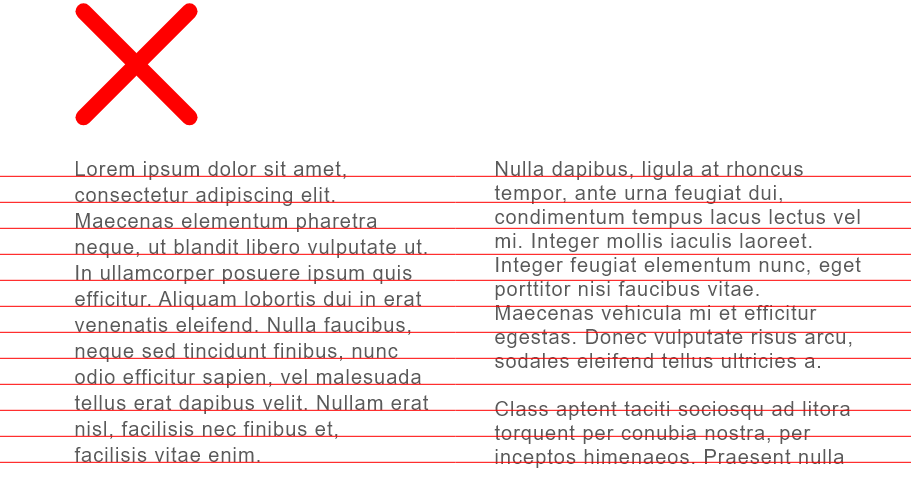
Items to watch out for typesetting
1 Rags
In typography, “rag” refers to the irregular or uneven vertical margin of a block of type. Usually it’s the right margin that’s ragged (as in the flush left/rag right setting), but either or both margins can be ragged.
When setting type with a ragged margin, pay attention to the shape that the ragged line endings make. A good rag goes in and out from line to line in small increments. A poor rag creates distracting shapes of white space in the margin. Don’t rely on the line breaks generated by your software application; get in the habit of spotting and correcting poor rags by making manual line breaks or by editing your copy. Slight adjustments in point size or column width might work as well.

2 Widows


Quisque sagittis feugiat arcu vitae venenatis. Praesent lacinia semper lacus. Vestibulum finibus sem vel ligula pellentesque, et scelerisque diam pharetra. Pellentesque tincidunt dui eu metus aliquet, in eleifend diam elementum. Praesent leo eros, vulputate eu arcu in, semper tincidunt orci. Duis faucibus lacus vitae massa interdum eleifend. Fusce vitae rutrum praesent.
Quisque sagittis feugiat arcu vitae venenatis. Praesent lacinia semper lacus. Vestibulum finibus sem vel ligula pellentesque, et scelerisque diam pharetra. Pellentesque tincidunt dui eu metus aliquet, in eleifend diam elementum. Praesent leo eros, vulputate eu arcu in, semper tincidunt orci. Duis faucibus lacus vitae massa interdum eleifend. Fusce vitae praesent.

3 Orphans
1, 2, 3 https://www.fonts.com/content/learning/fontology/level-2/text-typography/rags-widows-orphans
Quisque
sagittis feugiat arcu vitae venenatis. Praesent lacinia semper lacus. Vestibulum finibus sem vel ligula pellentesque, et scelerisque diam pharetra. Pellentesque tincidunt dui eu metus aliquet, in eleifend diam elementum. Praesent leo eros, vulputate eu arcu in, semper tincidunt orci. Duis faucibus lacus vitae massa interdum eleifend. Fusce vitae.